How to Prep Product Designs for a Sales Demo
So your team has designed and built a beautiful, valuable, and marketable MVP. The designers have been working closely with the dev team to make sure the product is built according to spec, and making sure the users’ goals and problems are addressed every step of the way.
The product is running smoothly and all is well, until the sales team swoops in and starts asking for screens that they can show off to potential customers for a sales demo.
The easiest (and often worst) decision in this scenario is to just send over the mockups that are already done. Don’t do it! The mockups that the design team has been working on have been designed to communicate with developers. They aren’t [necessarily] the groomed, beautiful looking screens you want your customers to see.
Your designers might say, “I’m here to advocate for the user! Not a marketer trying to sell products.” Wrong. Their job is to make sure that they are communicating your product’s vision no matter what the medium or use case is. Besides, what good is your design if no one ever buys it?
You can’t solve someone’s problem if they don’t even know a solution exists.
When prepping your design mockups for a sales demo, there are a few things that you need to make sure are addressing your audience:
Highlight the right features – even if they aren’t the most visually interesting
One of the highest priorities when showing off the product during a sales demo is minimizing distractions and focusing the talk track on the most relevant value props.
Let’s say your product is a recruitment tool that uses analytics and a recommendation engine to help recruiters find the best matches in terms of candidates. As a designer, I know you want to show off those well-designed messaging interactions and animations that you spent hours crafting to make beautiful. Don’t do it. If what speaks to your users most is the recommendation engine, communicate that value by simply showing a notification window that spells out exactly what is happening.

Save yourself from showing a long, drawn out user flow. This one small notification bar speaks volumes about the value prop of your application.
Bonus Tip: if there is a main feature in the application that will be the focal point of the conversation, give it some kind of pseudo-branded name. Instead of talking about all of the detailed interactions that your messaging platform can perform, sum them up with a name like “Smart Message Actions” – that way the customer can focus on overall value props and not have to decipher a step-by-step workflow.
Use relevant content & data
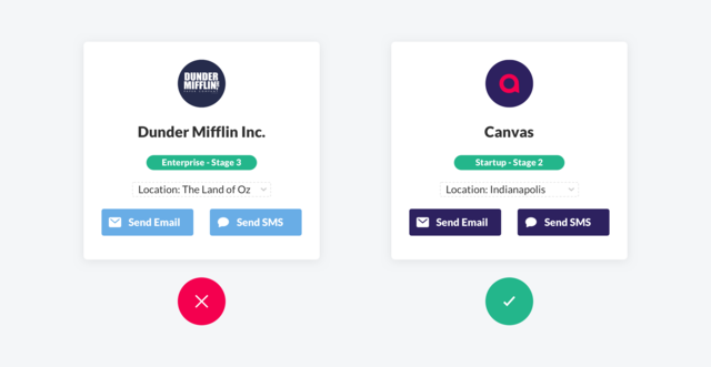
Few things can be more distracting when looking at product shots than incorrect or cheeky sample data. Sure, the dev team may have enjoyed all the users in your app being named after characters from The Office, but a customer seeing the name “Michael Scott” and a goofy profile avatar in a data table will completely derail their train of thought.
To remedy this, do some quick research. Find out who the client’s customers are and use them in your mockups. Think about who the user will be at the prospect’s company and personalize the data in the mockups to reflect their use cases. Your personal touch will mean a lot to your client’s prospective customer, and get them thinking about how their product can really be used in their context.

Brand the app for the customer
As superficial as it may seem, a simple logo in the corner of your design can go a long way. Pulling up a mockup of your application during a sales demo that’s fully white-labeled and branded to the customer’s company is an easy win and adds some ‘wow’ factor that you didn’t know you were missing. It makes the conversation with the customer more personal, and they will appreciate the attention to detail.

Even if the product isn’t going to be white-labeled for the end customer after they buy, it’s still not a bad idea to throw their colors in the deck to weave them into the product shots themselves. For the prospect, it’s akin to test driving a car. They’ll start to visualize how the product will fit into their day to day operations.
Conclusion
Now, there is some finesse with these tactics. If your team is going on an all-out sales spree and talking to dozens of customers in a short period of time, having your designers spin up customized mockups for each and every one of those prospects is probably not the best use of their time. If they can templatize their work to the point where this won’t be overly time-consuming, great. If not, come up with common design assets using the tactics above to cover most bases, and you can always do some more custom work for those whales that the sales team encounters every once in a while.
When prepping your product designs for a sales demo, it really boils down to two main goals: avoid distractions and add a personal touch.
You want the product to speak for itself, and any distractions or unnecessary content will only get in the way of letting your sales team do their magic. If that customer notices a personal touch, it helps them think about the product from their point of view; it might just be the reason why they decide to give that demo of yours a try.


