On the Current State of Design Systems
I’ve been involved in no fewer than three different initiatives to create a design system in my career. 10 years ago we simply called them pattern libraries. A few years ago, Atomic Design entered the scene and provided a more comprehensive grammar around design systems. Once Google unveiled Material Design in 2014, the concept of design systems had finally matured.
Now, the design system concept seems to spawn an article every day. The theme of these articles typically espouse values of systems as providing consistency, efficiency and scale. But at what costs? Are design systems a panacea for all that ails UX design?
In this article, I’ll provide some nuance to the design system trend. I’ll start with a brief history and rationale behind design systems in UX and end with key considerations and recommendations as you consider using them in your own work.
A brief history of design systems
Pattern libraries
These have existed in other fields for decades. A wonderful example is A Pattern Language by Christopher Alexander.
Don’t let this tiny image fool you, this book has lots of pages.
This beautiful book establishes guiding principles for building and urban planning. Written in 1977, it still continues to influence landscape designers and architects today.
In interaction design, the first iterations of this appeared in the early 2000’s with several sites (many now defunct) which sought to catalog all the patterns that existed out in the wild. The site ui-patterns.com is a relic of this past as it seems to offer no real curation. Instead it focuses on establishing what patterns exist and collecting many examples of each.
In 2005, Jennifer Tidwell wrote Designing Interfaces — one of the best books on the subject. The examples are obviously dated, but she coupled UI patterns with HCI well.
I guarantee this duck never designed an interface in its life.
These early attempts at design systems in the realm of UX were largely driven by a need to make sense of the expanding world of UI by collecting exemplars. In a world without Dribbble, mobile OS’s, a predominance of native desktop applications, and fairly limited web technology, the early design systems seemed largely driven by collection and sense-making.
Early UX design systems provided a survey map for an emerging UX field carving out space in a new frontier.
Atomic Design
This all started to change with the onslaught of new UI technologies in the late aughts and early 2010’s. Flash and desktop-based software gave way to mobile apps and cross-platform UI.
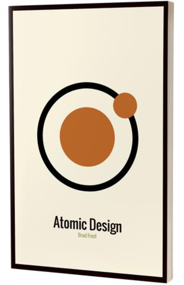
Atomic Design by Brad Frost
In parallel, we saw how abandoning the comfort zone of Windows chrome left a lot of UX designers (like myself) panicking because we needed to understand how to build a framework in addition to actual screen flows. Brad Frost’s Atomic Design framework was the first large-scale attempt to break out of exemplars and establish a framework UX designers could use to build upon.
However, for all that Atomic Design offered, it swung in the opposite direction from early pattern libraries. Its framework valued flexibility at the expense of providing guidance to when and how to use elements.
Corporate-driven design systems and component libraries
Material Design changed all that when their design team published their guidelines and principles in 2014. The press around it was largely focused on the aesthetics — that it was an answer to the raging skeuomorphic vs. flat debate (we all lost in that battle). The marketing was largely centered around how they used paper as a metaphor. But underneath the surface lied an evolving system any designer could use; a collection of elements, patterns, backed by rationale and usage guidelines.
Since Material Design’s entry we have seen an increase in corporate-founded design systems. From Salesforce Lightning to IBM’s Visual Language, to VMWare’s Clarity system. These systems are characteristically coupled with code to enable their platform developers.
Not to be outdone, the UI developer community has stayed in lockstep by creating UI libraries to match these design frameworks; from Material Angular to building React components tied to design assets.
Where are we today
The design system has undoubtedly evolved in meaning and utility for UX designers over the last 20 years.
What started as a means for making order in the wild west of UI design, has now evolved into the promise of providing consistency, optimization, efficiency and scale.
But at what cost? The promises of today’s design systems are often at odds with the innate practice of design. Standardization and optimization rob designers of the ability to explore and experiment. Designing for scale incentivizes using well-worn standards. Tying a system with development increases the cost of making changes to a UI component.
On the other hand, the ability to create repeatable design for growing products is undeniable. Scaling your work to handle 100 users in month one to 150,000 users in month twelve is challenging. If a design system can help, it might be worth the cost to innovation. Large companies that can use systems to streamline the work of dozens or hundreds of remote designers can ultimately serve their customers more effectively.
Key Considerations for your Design System
It’s worth repeating my own history to provide some context. I worked as an in-house designer for Wind0ws-based software for four years, then for a legacy (i.e. old) web-based software for another three. Since 2015, I’ve been working with an agency on iOS apps and web-based products — primarily for startups.
My experience has given me a broad sense of where design systems are most useful and when they are detrimental. The growing volume of content surrounding design systems makes it difficult to discern how it works for any specific situation. In this section I will shed some light on what to consider when thinking about implementing your own design system.
How important is consistency?
I hate this word more than any other in design. There is a very low bar for consistency we must all abide by. Whether it’s through the affordances Don Norman talked about in that one book we all had to read ages ago, or through following common frameworks — designers must maintain some consistency.
But consistency as its own goal often gets bastardized and twisted into meaning “the same.” Great designers see gray area. Consistency to a senior designer simply means that the UI solution is appropriate to the context and matches solutions to similar problems. Armchair designers love to nitpick at companies’ lack of consistency between their products (we’ve all done it).
But it’s difficult to see most consistency issues having a massive business impact for most situations, particularly when a business is in a high-growth mode. Yes you will accrue design debt over time — and like my student loans, you will pay this off someday (nope). But as you are growing a product and establishing market fit, creating a design system to manage efficiency isn’t often the best use of time.
How large is your design team?
If your answer to this question is, “which design team?” then a design system is probably well-suited for your situation. Large design teams imply several products, and several products often imply acquisitions have been made. As a result, Design teams have grown by acquisition, and products have been developed with different cultures and practices. To coordinate this fragmented situation, design systems can greatly facilitate communication and consistency — which will allow your company to continue dominating whatever market it’s in.
If your team is small or growing, a design system is overbearing. In fact, it’s better to allow different designers have a chance at crafting a system organically. In the end, a close-knit design team will leverage best practices naturally and will find design ops to be a hindrance.
How will you maintain your system?
Another reason to exercise caution when you have a small team is due to ongoing maintenance costs. These things don’t manage themselves. UI standards evolve, aesthetic norms change. Even a fully optimized and automated system will be hard to keep up. Often it can take a full year to have even an MVP built for a design system. By the time you build additional components or templates, the landscape has changed.
Adding complication to this topic is the situation whereby the design system exists in design and code. This will truly test the teamwork of your design and dev teams. Who owns it? Systems today seem largely driven by efficiency and if they are in code, design has a slim chance at owning it.
While it may be clear that dev will own the system, deviation from initial designs are inevitable. How will this get communicated upward? New design tools are promising to streamline this process yet still bypass necessary communication of intent and rationale. No designer wants to open a Sketch file to find that the cards they designed have been modified overnight. Likewise, no developer wants to open up their IDE and see massive CSS changes auto-propagated because some enterprising designer just learned Grunt.
The promise of maintenance costs has not quite matched the reality of 2017. It will some day, but even then, be wary of social and cultural impacts of systems that reduce inter and intra-team communication.
What’s more important: scale or survival?
My biggest gripe with design systems is the underlying assumption that every product and company must build to scale.
Don’t scale before you need to.
This theme has been echoed in development and building product — don’t put the cart before the horse. We all idealize what our design systems will look like and then want to build it out from scratch. But you need to give yourself time to actually design screens and experiment with different approaches. You can’t possibly know what the right navigation pattern to use is until you’re 40+ screens into designing the whole app. It’s foolhardy to expect you can foresee how your product will grow. Startups in their second year may still be finding product fit. Large companies may completely abandon projects after sinking millions if the market changes.
In times of growth and experimentation, temper the desire to systemize design. Instead, accept inevitable change, and build the design system when you need scale.
Lastly…don’t forget innovation!
No matter how large your team is, you need room to innovate. Designers need space to experiment outside the rules and guidelines of the mothership. The beauty of design lies in the unexpected solution which emerges from nowhere. The more systematic and codified the design process becomes, the harder it is to achieve this magic.
If you need a design system in place, ensure that design teams tasked with new features and products have time to design outside that system. In the end, great designs can be molded to work within the system. And more often than not designing on the fringe will have a positive downstream effect on the design system itself.
Design is a unique field which blends art and science but with its own mix of abductive reasoning and speculation that can lead to unpredictably amazing solutions. Implementing design systems in organizations must be done with care so as to optimize the right parts, while still offering the creative, untethered freedom design needs to explore. We should all be so lucky to nurture a product to the point where design systems are critical. But until that happens I advocate caution and to keep focus on innovation.
Further Reading
Selling a Design System at Your Company
A closer look at our Atomic Workflow in action
How we’re using Component Based Design


