


5 Techniques for Building an Adaptive Brand Identity
Brand identities in the startup world can be fairly shallow, rarely venturing beyond a simple logo, website, and email signature. Brands are afterthoughts. There are sites that allow you to pick random names, and others that let you generate random logos. It’s enough to start marketing your product or service and file with the government for a tax ID number.
I get it!
When you’re a startup, you play to your strengths and prioritize what is going to get you another month of runway. But at some point, if and when you do get over the hump, your product identity will become critical to support continued adoption and growth.
Identities play a particularly interesting role in digital products because it’s often hard to guess what a product will morph into over time. You may pivot away from a target market or industry. You may create more features or products than you originally anticipated. You might be building a digital platform that simply didn’t exist when you initially launched.
Adaptive identity systems are bigger than a single logo or wordmark. Unlike Nike or Apple, you often won’t get to slap your brandmark onto a physical product for all the world to see. In fact, your brand touchpoints will often be understated, only surfacing through marketing or customer engagement.
We’re going to look at some variations of adaptive identity systems and break down why they’re useful, and when they might suit your needs.
Note: When thinking of your brand, worry less about visuals and more about longevity, extensibility, and hierarchy. Adaptive identities are beholden to trends in design, but different systems are better suited for different purposes.
1. Platform Identity System
The best corollary for this type of brand identity system is found in large consumer corporations carrying multiple brands, otherwise known as a “house of brands.”
Companies like Proctor & Gamble or Nestle have their own core brands, but the products themselves carry the core weight of consumer-facing brand value.
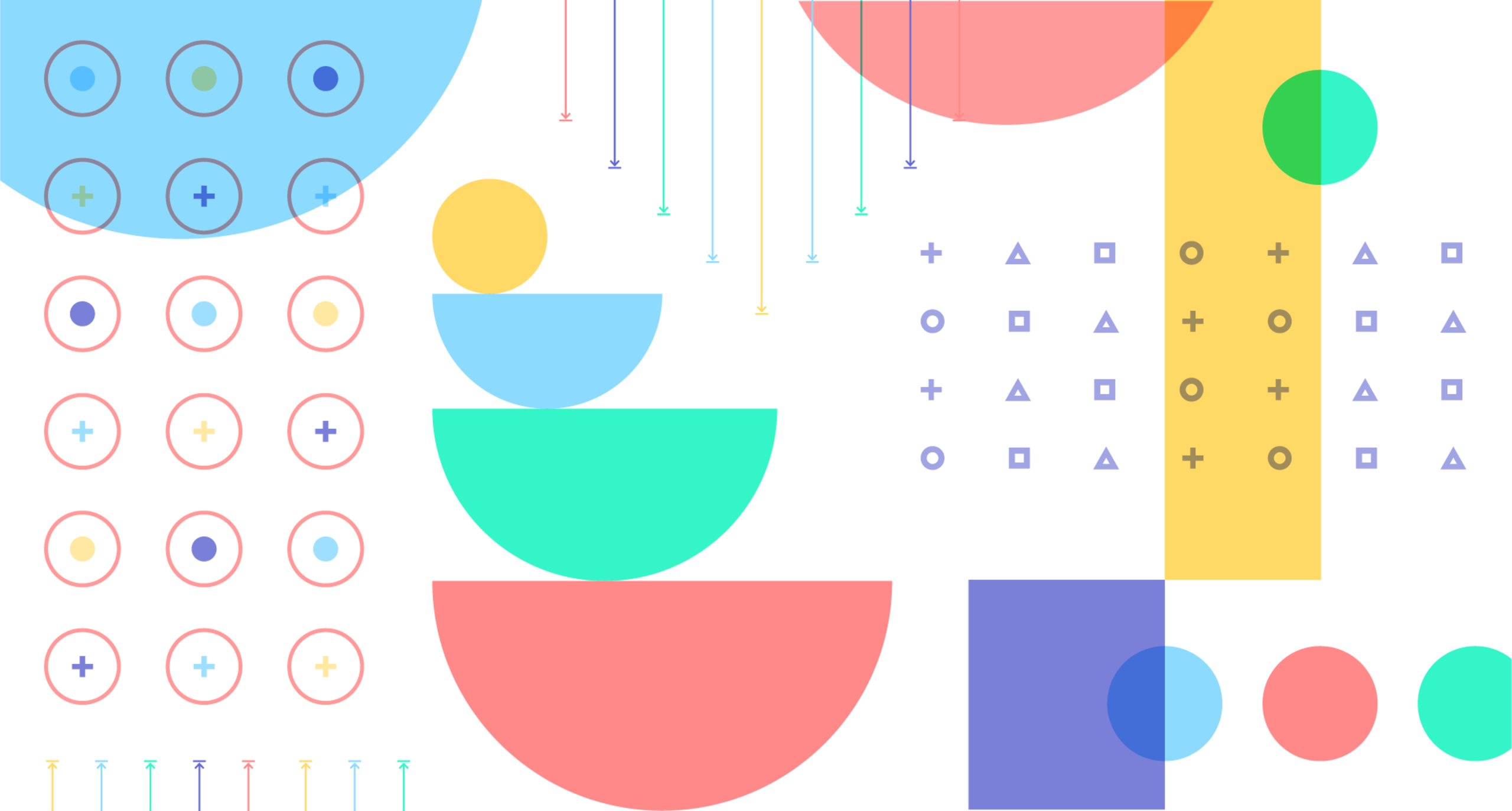
In the digital product world, a perfect example of this is Stripe. Their mark is perfectly suitable, but it’s intentionally vanilla. Stripe’s identity is based on color and shapes, which is seen throughout their site. These elements are then used to create branding around each of their products.
Stripe’s logo sits at the top left in all its vanilla glory, contrasted with brilliant icons for each of its constituent products. The icons are distinctive, yet feel cohesive around their well-defined visual aesthetic. Most importantly, they have an architecture that supports more products as they continue to grow.
Good for: Platforms and ecosystems of products where the brand equity is more valuable in the product(s) rather than the underlying platform.
Platforms and ecosystems of products where the brand equity is more valuable in the product(s) rather than the underlying platform
2. Visual Categorization
For many product companies, iconifying your products might not be necessary at all. Instead, you may choose to leverage a base logo and tweak its visuals in a meaningful way. In traditional brand architecture, this is more akin to a “branded house” strategy where the core brand serves as the driver for all sub-brands.
Back in 2012, USA Today dramatically simplified their previous mark into a filled circle with supporting type.
It may feel like they totally lost the brand equity they’d built with their iconic globe logo from decades before, but the intention was to re-architect their brand to better support the content they served.
Brand New covered this well, showing how this architecture could be used both with color variations and inset graphics tied to different types of content:
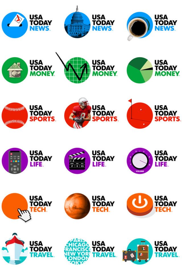
Color variations put graphics at the forefront, and these graphical variations give them more branded marks to work with. Instead of balancing their brand on a single mark, they’ve embraced the fact that people consume their brand in vastly different ways across various social and digital platforms.
Good for: Content-heavy platforms where categories are more important than productizing.
3. Content Canvas
This technique has been around since at least the 1990s when I was still watching MTV:
The logo acts as a canvas for content. The underlying visual structure is unchanged, but what is inside it can be just about anything. The earned advantage is that you can evolve your identity with trends, or change its appearance to match different occasions.
This is the most prevalent adaptive identity technique used in digital products today. It’s fairly easy to pull of technically but it also provides content-oriented platforms the ability to take emphasis off their own identity and put focus on the content they provide instead.
Pandora’s 2016 redesign exemplifies this perfectly:
All Paypal lawsuits aside, this makes perfect sense for Pandora. Like MTV was in the 80s and 90s, Pandora is a platform for music and wants their mark to be supportive. It’s true that their mark is remarkably similar to PayPal, but outside of the app icon on your mobile device, it’s unlikely you will ever encounter the logo in it’s PayPal-likeness glory.
As an aside, PayPal does care because they have a lot more equity in the mark since it appears on hundreds of thousands of eCommerce sites and payment screens.
This technique is similar to Visual Categorization in terms of execution, but the difference is that there’s no limit on the content that can go inside the logo. Pandora, for example, is not categorizing the content based on genre. It’s less structured so that the logo becomes a miniature content medium itself.
Good for: Sites, services, and products where content is varied and highly visual; Products who are less concerned about recognizability of their mark on its own.
4. Categorical Spatial Adaptation
This is another technique that has gained quite a bit of traction over the past several years. This type of identity system utilizes key visual elements and configures them in ways that can create multiple sub-brands.
A stunning example of this is the MIT Lab identity done by Pentagram in 2014:
The base mark for MIT Lab is reconfigured to become marks for other departments within the school. Additionally, visual elements are altered to create patterns or smaller symbols used in the building itself. The identity adapts to the space, but often with an iconic purpose.
Slack takes a similar approach in the way they used magnified variations of their logo to create default user profiles avatars in the application.
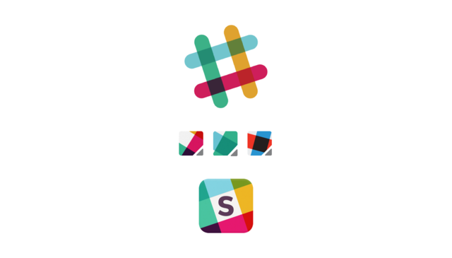
However, in Slack’s case, there is no intent behind the configurations. It’s inspiring for products that might experiment with using their logo in different ways inside their actual product.
Brands utilizing this system generally enjoy frequent and habitual usage (students for MIT Lab, users for Slack) where their primary mark is already well known. The system serves to provide a sense of familiarity that drives ongoing recognition.
Good for: Products, services, or brands with habitual usage or experience.
5. Infinite Spatial Adaptation
This technique is still in its infancy, but that doesn’t mean it can’t have the nerdiest name. In some ways, this takes an almost nihilist approach to the brand by utilizing the most minimal visual element it can and adapting it to fit whatever spatial context its in.
Totally lost? Me too.
Let’s just look at an example from the Whitney Museum’s rebrand from 2012:
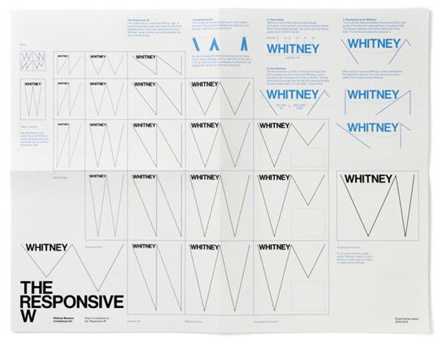
In this identity, the “W” is the only recognizable visual element, but it’s never shown in the same configuration.
This allows for infinite flexibility.
As far as we’ve seen, this hasn’t yet been applied in the digital product space, but there’s something intriguing about it when you think of responsive web design. Imagine an identity that adapts to the myriad screen sizes and platforms that brands now find themselves wading through.
This technique is risky for most startup products because 1) it challenging to pull off, and 2) it requires your brand voice be communicated in other ways.
It’s unlikely that we’d see such an approach for a new, unknown museum, but Whitney has a rich history to draw upon. Additionally, they bolster the identity with typography.
An infinitely scaleable identity will surely stand out, but must be accompanied by equally strong supporting brand touchpoints.
Good for: Products, services, or brands with habitual usage or experience; Brands that establish identity through other content or visual elements.
Summary
Adaptive identity systems may not be appropriate for all digital products. And often, they might be too robust for a fledgling startup to undertake when funding, traction, and company growth dominate your day-to-day.
But for products that want to establish a strong foundation, or for those that are revamping an identity to prepare for high growth or expansion, adaptive identity architecture is a strong approach to take.
It provides a foundation that can be scaled along with your digital product (varied based on any number of new products you can’t predict) and shields your product from the fast-expiring visual trend cycles. Additionally, like a well-architected home, adaptive identity systems ensure that you won’t have to overhaul your identity as you grow, and instead, add-on gracefully and make simple adjustments.
 Share:


