


Creating a Modern Free Trial with Experiential Product Sites
So you and your team have designed and built a valuable, beautiful, and usable digital product, and you are working on a way to sell it. You have a landing page, a digital marketing campaign, and some social channels spreading the word, but you’re still having a tough time acquiring and activating leads.
The free trial approach is certainly a well-known option, but it’s not always the right approach. The key to product marketing is to connect your product’s value with your potential buyer’s pains. Strong messaging on your website helps, creative lead generation tools help, and yes, even free trials of your product can help. But there’s a growing technique that merges the three, called an “Experiential Product Site.”
What is an experiential product site?
An experiential product site provides the experience of your main product in the form of a free tool. Users stumble upon this tool because they have a specific need or problem to solve. In the end, the goal is to convert these users into customers of your main product.
Think of it as a way to guide customers through your conversion funnel, while simultaneously impressing them with direct and meaningful value.
Experiential product sites are a perfect blend of product design and product marketing. In this article, I’ll break down how the most successful experiential product sites:
- Provide true value to the user with a tool they need.
- Are easily accessible and sharable.
- Hint at the magic of your main product without giving it all away.
- Uncover gaps that the user has and proves to them that you can help.
- Convert the user into a lead, and potentially directly into a customer.
Provide true value to the user with a tool they need
Every business should know their users. They should know what they want, what they need, what other products they use, how they act, and what drives their decisions. After understanding these factors, dozens of potential product ideas can be unearthed. Typically, strong digital products hinge on one key concept, but there are many ways to communicate this idea that extend your product into valuable tools for a customer.
HubSpot is an inbound marketing and sales software with a large suite of tools that aim to be your business’ one-stop-shop for digital marketing. Outside of their main core product, they’ve introduced a couple of experiential product sites over the years that help address specific marketing needs, with the most popular being the Website Grader. All you have to do is enter your website’s URL, and you’ll receive a snapshot of its SEO ranking, performance and security statistics, and a mobile performance score, along with detailed metrics on how these scores are calculated.
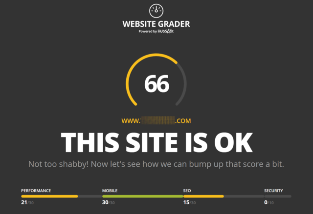
Any digital marketer will tell you that these are all essential benchmarks that need to be considered, and this tool presents that information for free. A lot of value is passed on to the user, but in doing so, it also establishes trust and builds HubSpot’s reputation as an expert in the marketing space.
Easily accessible and sharable
For product sites to catch on and build an audience, they must be incredibly easy to access and use. This means no account creation, password remembering, or signup involved. The best examples gather a little bit of information, but keep the process as non-invasive as possible and only introduce forms when necessary. HubSpot, for example, only asks for an email address.
Snappr’s Photo Analyzer is a tool that analyzes your LinkedIn photo using image recognition and machine learning to predict your photo’s performance based on research of how people visually perceive “competence, likability, and influence.” I know, I know, it’s a little creepy. BUT, the site makes this tool easily accessible, and therefore, sharable.
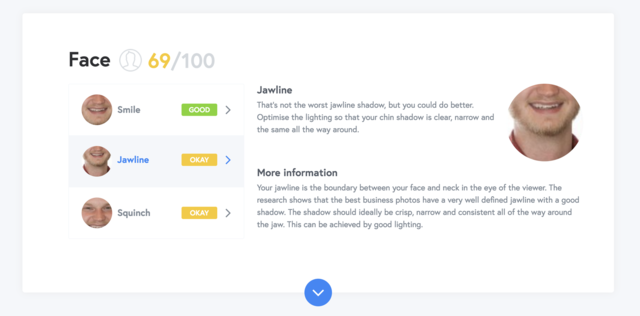
Please hold: I’m crying in the corner because the smart computer tool told me that my jawline is just “okay.”
After clicking the “Analyze My Photo” button, you’re prompted to sign in via LinkedIn and then revisit your report. Although I said no signup is involved, their process makes signing in so effortless it doesn’t even feel like you are doing so.
Because of its low-barrier entry, this product made its way around the internet as a viral, novel tool, but also proved to be a smart marketing technique for Snappr’s primary service, which is a way to instantly connect you to a professional photographer for a low fee.
Hint at the magic of your main product without giving it all away
A great experiential product site will seem like a magic trick has happened in front of your eyes. Going back to HubSpot’s website grader, all you do is enter a URL and it spits out an entire report full of information that analyzes dozens of metrics. Now, maybe some of the information might not be directly actionable or beneficial, but just seeing the size of the report itself makes an impact on the user. They even use a nice gauge animation (filling up as it loads) to give the perception that the site is working hard and crunching big numbers behind the scenes. It gives HubSpot a level of credibility that might not have been there before, which leads me directly into my next point.

HubSpot even uses the loading animation as a way to share knowledge.
Uncover gaps that the user has and prove to them that you can help
As your experiential product site makes you look more impressive and credible to the user, it simultaneously uncovers potential gaps in knowledge that the user has and places you first in line to fix them. Some of the language that HubSpot uses in its report might go right over the average digital marketer’s head, which is probably their intention. It makes them think, “Wow, HubSpot really knows a lot about these metrics that I wasn’t even aware were important.”
Another experiential product site, CoSchedule’s Headline Analyzer, helps you organize your entire marketing strategy into a single calendar. How could you possibly convey those pains succinctly? The answer: an experiential product site where the user enters a potential blog post headline to be analyzed based on a handful of metrics, resulting in a score from 1-100. What does a headline analyzing tool have anything to do with calendars? Well, the report is similarly as long and drawn out as HubSpot’s, but they also show their expertise by placing their own thought leadership articles in relevant areas on the reports.
Again, they are proving their value as marketing strategy experts, exposing gaps in the user’s own capabilities, and positioning themselves as the best option to help them fill these gaps. (All while providing a useful stand-alone tool in the meantime.)
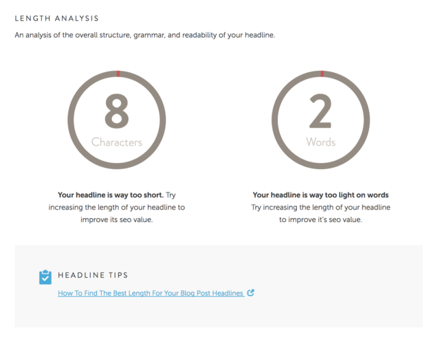
Your headline may be short…but we know exactly where to find how long it should be!
Convert the user into a lead and potentially directly into a customer
When you execute all four of the above tactics correctly, a lead will be generated. The examples I’ve referenced use non-invasive techniques to gather enough information from the user to start a drip-campaign, but you can also place strategic calls-to-action around the site to help convert the user into a customer.
The reports generated in these examples are long and meticulous in an attempt to surface unknown pains and quickly establish expertise to solve them. Of course, these reports provide instructions and references on how to remedy the gaps that were uncovered, but that usually comes in the form of dozens of long, tedious, educational blog articles. After all, why go through all the work attempting to figure out how to solve these problems on my own when there’s an option right in front of me that will take care of them? *clicks to sign up*
 Share:


