Splash Pages at Startup Speed
Fact: If you have a business, you need a website. But startups move fast, and as a result, it can be nearly impossible to create, update, and maintain a website in the early stages of a business. When you’re ideating every day, your brilliant idea from last week might be in the garbage tomorrow.

Some of my early ideas.
All of a sudden, the way you so articulately described and beautifully illustrated your product is no longer accurate. And because you’re so busy running a business, there’s no time to update it.
So what can you do? Well, you can’t do nothing. Where else are you going to send your potential customers, investors, grandma, college roommate’s cousin’s boyfriend, etc. to prove that you have a real, business-worthy idea?
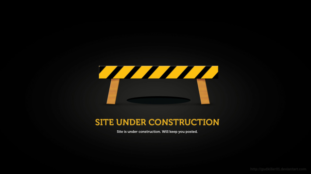
Early iteration of my college portfolio (still working on it)
This isn’t 1999 and nobody really cares that your site is “under construction.” You paid for the domain (hopefully). You got the trademark (right??). Now you need something public.
Introducing the splash page.
The splash page is a single-page website, often no longer than the height of a computer screen. Its purpose is to act as a placeholder for a full site in order to establish credibility while a product or company is still in the early stages.
In this article I’ll show how effective splash pages:
- Prove that you exist
- Allow you to experiment with messaging
- Build your customer base
- Create anticipation
- Drive downloads and signups
1. Prove that you exist
Every entrepreneur will remember the first time someone asked for your website, and you had nowhere to send them. Five minutes later, after frantically digging through your bag for the-last-business-card-from-the-job-you-just-quit, you’re texting your old neighbor whose son “designed a logo one time.”
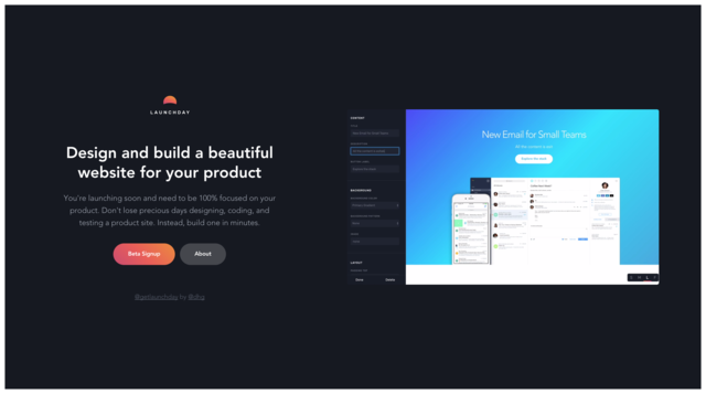
Launchday avoided this and did the “proof of concept” splash page well. (Bonus: spot the irony.)
2. Experiment with messaging
You’ve got a great idea, so obviously, people are going to love it, right!? But even the best ideas can be held back by vague messaging or an unimaginative brand. Splash pages are a fail-fast way to experiment with the way you talk about your product in the market. Minimizing content makes it easy to change anything that’s not resonating.
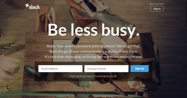
Slack’s early splash pages used bold-yet-simple messaging to attract users.
3. Build your customer base
You had the idea, and you’ve figured out how to talk about it. The only issue is the product isn’t quiiiiite ready yet. You don’t want the people who liked your idea to forget about you, so you need a way to get in touch with them when you’re ready to launch. Splash pages can help you build a base of loyal followers who want to be notified as soon as you are able to accept their money for your brilliant product.
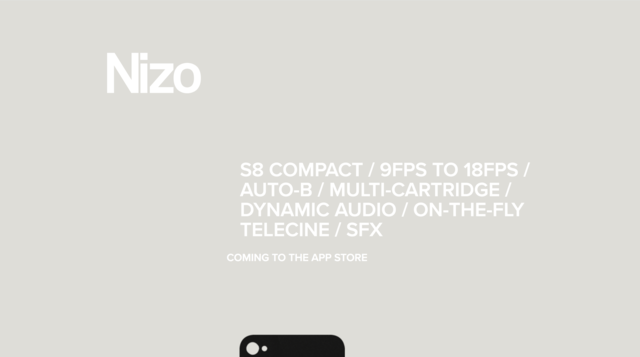
Nizo’s beautifully designed splash page captures emails – that’s it. See the real page here.
4. Create anticipation
As any nightclub bouncer knows, the best way to build excitement is to make people wait. Brands use splash pages to build anticipation while they’re perfecting the finishing touches. Having potential users sign up via a “waitlist” not only captures emails for future communication opportunities, it also establishes a premium brand. Other suspenseful CTAs include words like “private,” “invitation,” “request,” and “access.”
Carousel is currently busy populating their waitlist.

5. Drive downloads and signups
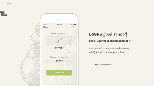
Sometimes your product doesn’t need a ton of explanation. People look at it and just get it. In this case, it’s safe to send them straight to the app store to download. You can also approach your splash page this way if you have something to offer, even if it’s a tenth of what your product becomes a year later.
Pearr is easy to understand because it does what we all already do in our heads: “How many drinks would this new pair of shoes cost?”
Your website will evolve multiple times over the years of your digital product’s life. When you’re moving at startup speed, a website shouldn’t slow you down. Splash pages are simple to make but can still provide a lot of marketing and branding value.
Whether you have your neighbor’s son code it, or you use a template from Squarespace, it doesn’t matter, as long as it’s easy to access online and easy to tweak.
What’s important is that you focus on generating interest, honing your messaging, and establishing your digital product brand. By doing that, you will be in much better shape when your product launches to market.


